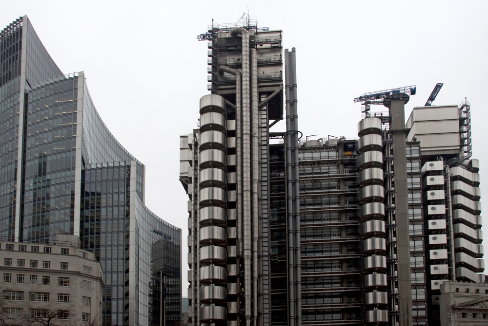
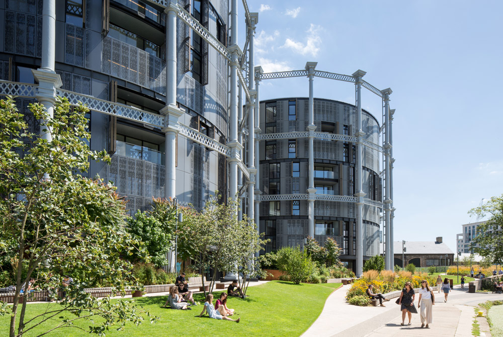
The Lloyds underwriting building on the corner of Leadenhall Street and Lime Street in the heart of the city of London, stands out as an exceptional example of modern architecture.
Designed by Richard Rogers and Partners it was completed in 1986 and given Grade 1 listed status in 2011. I was one of the architects who worked on it in the early days and I have always found the concept really clever and exciting. It is a rectangular office atrium building located in the centre of an irregularly shaped site, leaving the vertical cores and services to make use of the left-over spaces around it.
The other remarkable aspect of the architecture is that the elements of construction are given their own clear language using contemporary materials. The lifts for example are glazed wall climbers whilst the stairs are continuing tubes which wrap around their supporting structure. The ducts and pipework are also clearly picked out on the service risers so that you can see their individual functions. The toilets are designed as capsules clad in stainless steel and stacked as individual towers.
“…universally recognised as one of the key buildings of the modern epoch”
English Heritage
For me the visual effect of the expressed elements of the building offer a sculptural beauty and meaning, like the buttresses and stone vaulting of a Gothic cathedral.
In comparison with the normal rectangular towers which make up most of the buildings in the city, the Lloyds is a welcome relief. It has a joyful expressive exterior form, whilst the inside provides elegant, clear and efficient working spaces looking on to a beautifully lit atrium.
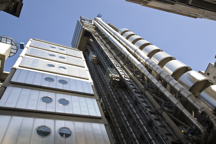 Exterior of the Lloyds building
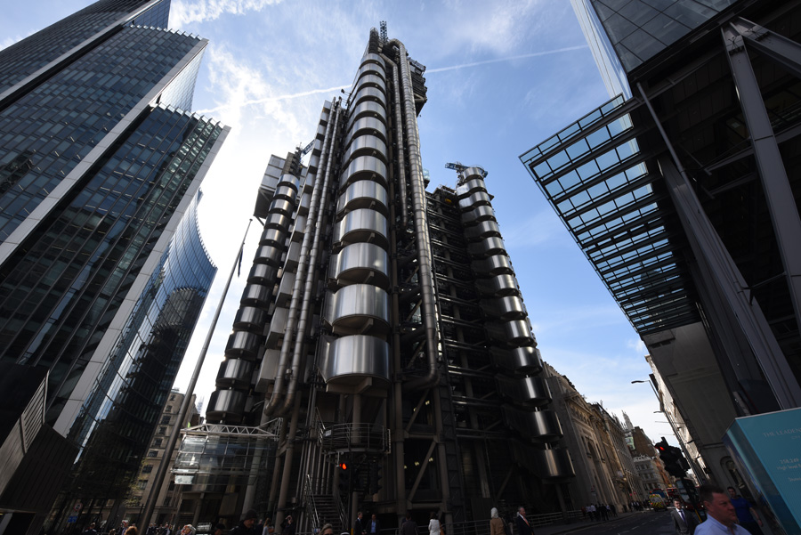 Exterior of the Lloyds building
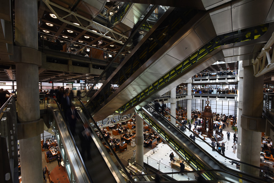 Escalators at the Lloyds building
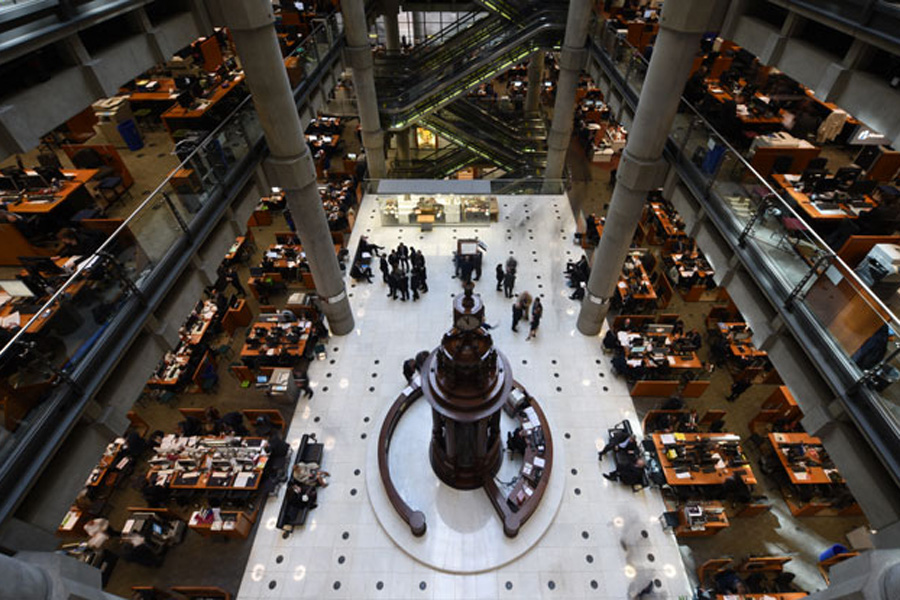 Underwriting room of the Lloyds building
The internationally renowned Lloyds Building designed by Richard Rogers took eight years to build on the former site of East India House in Lime Street. The building demonstrates many of the key traits of the high tech architectural style that emerged in the late ‘60s. The radical approach adopted by the architect saw all the building services banished to its exterior to create uninterrupted spaces inside – a vital part of the brief. It also gave great flexibility in terms of the internal use of the space.
Richard Rogers Partnership (RRP) proposed a building where the dealing room could expand or contract, according to the needs of the market, by means of a series of galleries around a central space. To maximise space, services are banished to the perimeter. As the architectural form of the building evolved, particular attention was paid to its impact on the surrounding area, especially on the listed 19th century Leadenhall Market.
When the building was given its Grade I listing in 2011 it was the youngest structure to obtain this status.
